Top 5 Reasons You Need a Responsive Website Design
You’ve heard the terms responsive website, mobile friendly, mobile first design and mobile app being floated around for quite some time. But what do they mean? And do you need a responsive website?
The answer is “yes.” Responsive design is more than a buzzword. It is the standard in web design.
Responsive website design, sometimes referred to as RWD, is a web design and development technique that enhances a user’s browsing experience by creating a flexible and responsive web page, optimized for any device from a desktop monitor to a smartphone. With RWD, visitors to your website will have a seamless experience when viewing your site on different devices, creating a user-friendly web experience and adding exponential value to your digital presence.
With a significant percentage of website traffic coming from mobile, you need to reach your customers where they are—on their phones. A responsive website design increases reach to customers and clients on smaller devices, such as tablets and smartphones and delivers a consistent experience across multiple platforms, which increases lead generation, sales and conversions. With a responsive website, analytics, tracking and reporting are streamlined, reducing time and cost spent on content management.
However, a responsive website is different than a mobile-friendly website, which does not change in functionality or design based on the type of device being used. It simply shrinks your website to fit to a mobile device—that means that a lot of pinching and zooming is required and certain features like navigation or dropdown menus may be lost. In fact, many times, mobile-friendly sites are not actually user-friendly at all.
Responsive web design works through Cascading Style Sheets (CSS), which use various settings to serve different style properties depending on the screen size, orientation, resolution, color capability and other characteristics of a user’s device. It ensures websites fit the screens of different devices automatically, displaying the content in a way that users expect. Instead of creating different layouts to fit different sizes and resolutions, responsive websites check the size of the device and automatically adjust to fit the screen size. This greatly reduces users’ operations, such as panning, zooming and scrolling when browsing the web.
Responsive design begins on the desktop with the maximum resolution, and it is then scaled to the smallest screen size. However, mobile first is a design strategy in which the layout is set up to provide a mobile user experience first, prioritizing fast download speeds and rich content. Then, the design and features are expanded to create a tablet or desktop version. There has been a distinct shift toward mobile browsing and responsive design, representing the simplest way to reach users and provide a seamless experience. The explosion of mobile end-users magnifies the need for mobile first in product design. The design process for mobile first, begins with CSS styles, HTML and Javascript.
Many large retailers have both a mobile site and a mobile app to meet the varying needs of their customers. Although mobile apps and mobile sites may look similar, they are very different mediums. A mobile app is designed for a specific platform like iOS or Android and requires a user to download it from the app store and install it on his/her mobile device, delivering a customized and intuitive experience. In today’s high-tech world, mobile apps are a necessary marketing tool. They are a direct marketing channel—allowing you to interact with customers in real time, cultivate customer loyalty, collect analytics for business building and increase brand awareness. A mobile app makes any business—big or small—stand out.
Mobile apps only function on specific platforms, but a responsive website can be opened from any mobile device.
A responsive website also increases the amount of time visitors spend on a site and improves search engine rankings. If your website does not easily allow clients and prospects to scroll and browse for information, you are likely missing out on business and losing customers. With consumers spending more and more time on mobile devices, your website needs to be responsive, so your company can stay in the game.
Understand the Elements of Responsive Design
For a website to be considered responsive, the design and development should respond to a user’s behavior and environment based on screen size, platform and orientation. It must be built with a fluid grid foundation, which is often referred to as a responsive web framework. That element allows a website to appear bigger or smaller depending on the size of a user’s device.
The development process begins by defining breakpoints, which determine when the fluid grid of a site will change size and when content on a page will be rearranged, hidden or swapped out. Breakpoints are often, but not always based on common screen sizes for different devices.
Images that are incorporated must be flexible, meaning graphics and text scale as they need to appear bigger, smaller or not at all depending on a visitor’s device. Lastly, different views must be enabled in different contexts via media queries, which allow designers to build multiple layouts using the same HTML documents by selectively using stylesheets. Media queries do the heavy lifting in responsive web design, creating fluid grids and flexible images, so that text appears correctly. Although media queries and breakpoints can’t be defined for every screen size, the selected sizes should work well within the responsive design.
Media queries rely on HTML and a CSS foundation that includes a flexible grid and flexible images. With responsive web design, the HTML of a website remains the same, but CSS media queries allow different portions of the CSS to be applied when the website is viewed on different screen sizes.
Wondering why now is the time to give your website a facelift and invest in a responsive design? To make it easy, we’ve outlined the top five reasons:
Reason #1: Provide a seamless user experience.
The number one benefit of a responsive layout is that it guarantees that any user on any device will have a consistent and easy experience browsing your website. From smartphones to laptops to TVs and tablets, we live in a multi-screen society, which means your website must be viewable across many devices—giving users the experience they demand. Consumers own many devices and want to move seamlessly between them throughout the day to make purchases, book travel, search for information and watch videos.
Reason #2: Boost SEO gains.
In response to the rise in mobile devices, Google, which has two search indexes—one for mobile devices and one for desktop computers—gives preference to mobile indexing. Therefore, RWD is a critical tactic in your marketing plan. A responsive web design increases visibility on search engines because it is mobile-friendly, offering more search engine optimization (SEO) opportunities with Google search results. Not to mention, responsive website design is the standard in SEO. Google rewards websites that create an optimal user experience.
Reason #3: Reduce costs and save time.
Some mobile websites were created with a mobile version on a subdomain of the original domain. With a responsive website design, content management is simple, and the versatility is remarkable. You don’t need a mobile version of your website for it to be mobile-friendly. Responsive website design writes a single domain that is used by various mobile devices. It also simplifies the reporting process by streamlining tracking and analytics monitoring. This type of flexibility is a huge advantage, especially when you need to make a quick design tweak or fix a typo on your site—you only have to do it once, saving you time for content creation.
Reason #4: More traffic.
With a responsive website design, pages will load fast without any distortion. That means that social sharing will be boosted and the bounce rate, the percentage of visitors that do not navigate to another page of your website, will be significantly reduced, resulting in more traffic to your website.
Reason #5: Increase conversions.
Reducing the bounce rate is a feat, but it is only half of the battle in increasing your conversion rate—the percentage of visitors to your website that take a desired action, such as making a purchase, completing a form or downloading a resource. A responsive website design that is conversion-focused will eliminate useless navigation and design elements, delivering an optimal browsing experience with sharp pages and fast page-load times. Your customers will reward you with more purchases and more contact submissions. But, if your website doesn’t support mobile users and seamlessly adapt to any device, conversion rates will remain dormant.
A responsive website design makes online shopping or even searching for a new apartment a quick and even enjoyable experience for customers. CMA has worked with several clients to turn a negative browsing experience into a fast and painless one.
How does responsive design convert users?
CMA works with each of its customers to establish critical components of the overall marketing strategy before a website or marketing campaign is developed. In the instance of Garden Communities, which offers 125 apartment rental communities throughout New Jersey, New York, Maryland, Massachusetts and Connecticut, the company needed an easy way to navigate with a new responsive website design to deliver the mobile experience that users have come to expect.
Responsive Design case study
CMA built a responsive website design that is user-friendly, easy to update and optimized for SEO. Google prioritizes mobile-friendly websites, making the redesign of Garden Communities’ website necessary for the company to remain competitive. With the new responsive design, the website delivers the level of functionality and responsiveness that users expect and functions flawlessly to improve the user experience and increase time on the site. It also improves mobile SEO to attract more customers and secure more sales.
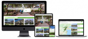 The new website makes it simple for renters to search available apartments in a specific zip code and make an appointment for a tour. To reach more customers faster, Garden Communities’ newly designed, responsive website incorporates a listing feed, which provides up-to-the-minute, real estate listings to websites like zillow.com and apartments.com.
Garden Communities’ new mobile-friendly website widened the potential customer pool to include anyone performing a mobile search. Now, prospects don’t have to hunt for the website or type in an exact web address. They can perform a search to find Garden Communities quickly and easily.
In the case of Garden Communities, planning and knowing the purpose of the website drove CMA’s design and SEO strategy.
The mobile-centric attitude of society is not going away anytime soon. We live in a mobile-first world and that means your website needs to render correctly on different devices and screen sizes, so that visitors have an optimal browsing experience.
One way to get started is creating a responsive website is to survey the landscape. Look at what your competitors are doing. Search for examples to determine what elements you like and to identify which components you would like to incorporate into your site. Choose websites that look good on different types of devices. The layouts should be fluid and content should reflow nicely. Having a secure website that is attractive and easy to navigate on all platforms makes users less likely to get frustrated and turn to a competitor.
Upgrading to a responsive web design will pay dividends. Not sure how to get start the conversion? Contact us today to get the conversation started.


